Intro
LA City website is a multipurpose platform serving different groups of audiences from LA residents to travelers, business owners, job seekers, policy gigs and etc. This information-based platform seeks to keep its users in the know about all the happenings and news throughout the City of LA. It also serves as a hub to connect the users with all sorts of City data.

Client: City of Los Angeles
Roles: UX/UI Designer, UX Researcher
Tools: Sketch App, Draw.io, Google Analytics, Marvel, Zeplin, Whiteboard, Google docs, Pen & Paper, Keynote
Platform: Desktop (Responsive Website)
Problem
Lacity.org is a great resource to access City data but this valuable set of information was scattered all over and every secondary page looked like a directory of links without any engaging visual elements or helpful content.
Design Goal
In this project, we were aiming to not only design for a modern look and feel but also to provide the users with a clearly classified set of information, encourage repeat visits, and increase the rate of retention.

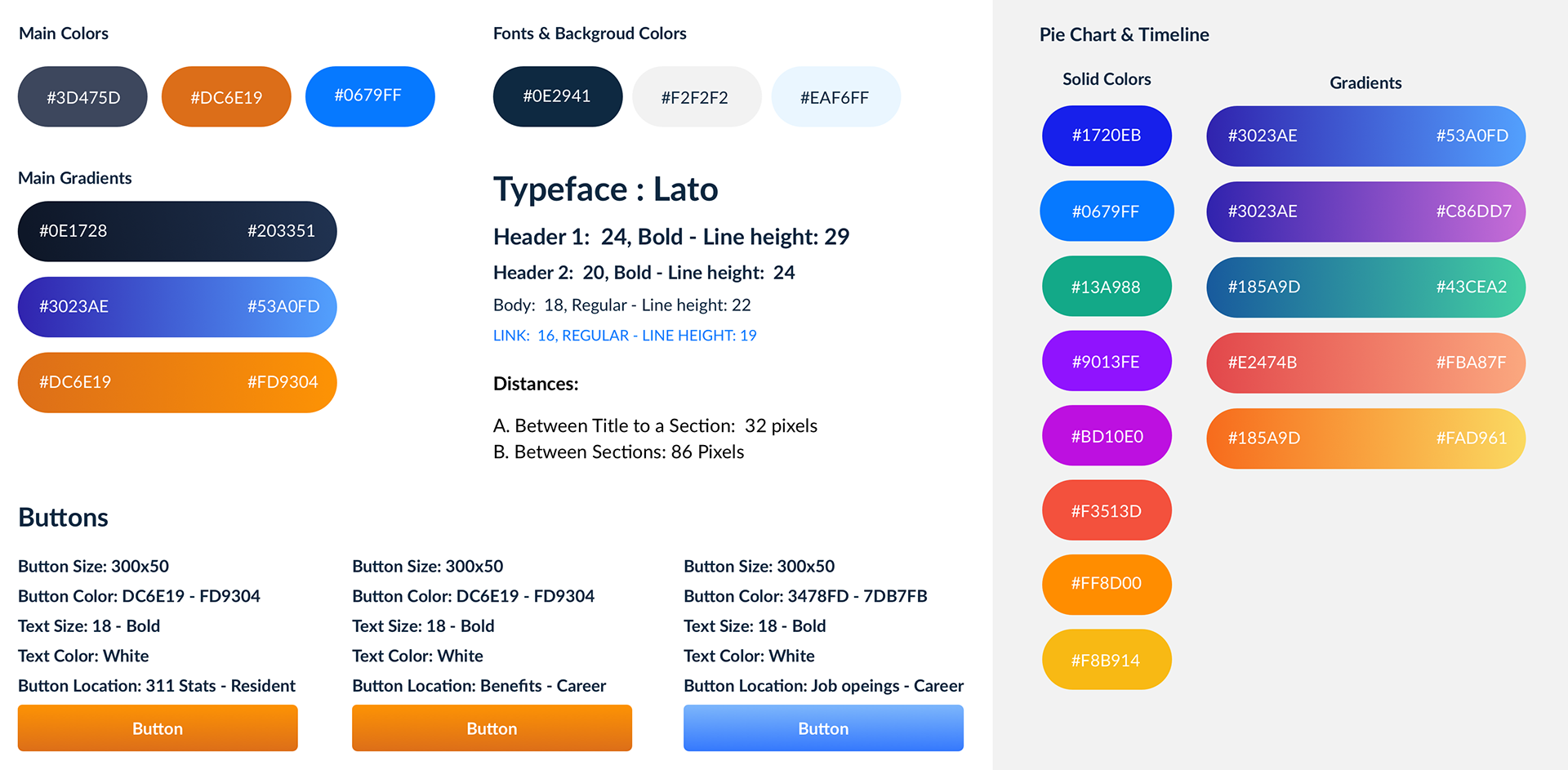
Style-guide
Sections of lacity.org
Besides the Homepage, Lacity.org is consists of 5 major sections: Residents, Business, Visitors, Jobs, and Government. Due to the City’s limitations on having long-term contracts for some specific roles, such as UX Design, every section of this website has been treated as a standalone project and was assigned separately as the contract got extended. There were pros and cons to this, pros: having a good amount of time to do research, study the target audience and understand the project needs and cons: having some challenges to keep the design consistent across the whole website.
Since this project had to be done in parts, UX processes needed to be repeated for each section. But they all shared these following steps:
Research: C&C Analysis, Content Audit, Google Analytics Review, Stakeholder Meetings
Planning: Restructuring Info Architecture, Card Sorting, Hand Sketches
Design: High fidelity Mockups and Clickable Prototype
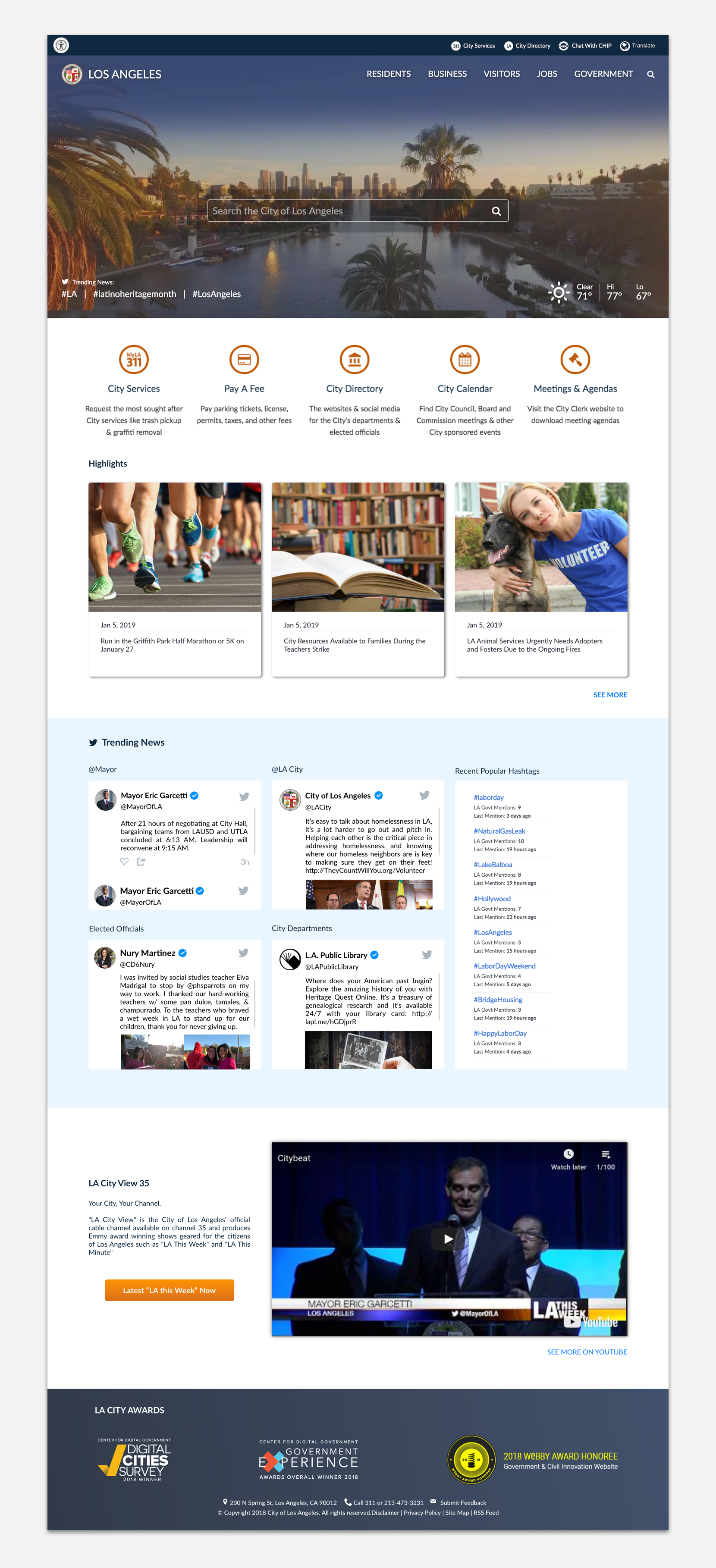
Homepage: LA City website’s homepage has always been a home to popular services and important news, however, this time more sections needed to be added to the homepage. One was the Twitter embed and the other was news videos from another City website called channel 35. Also, we were tasked to come up with a modern look and feel for this page. In addition to modernizing the main body, drone footage of LA city was suggested for the hero section with a more minimal global navigation. And other details were added over the video (like the weather condition) to encourage more engagement. Visit homepage live
(Please note in case of emergency, like natural disasters, another version of the homepage will be shown which is focused only on that particular disaster and it looks different than its regular version.)
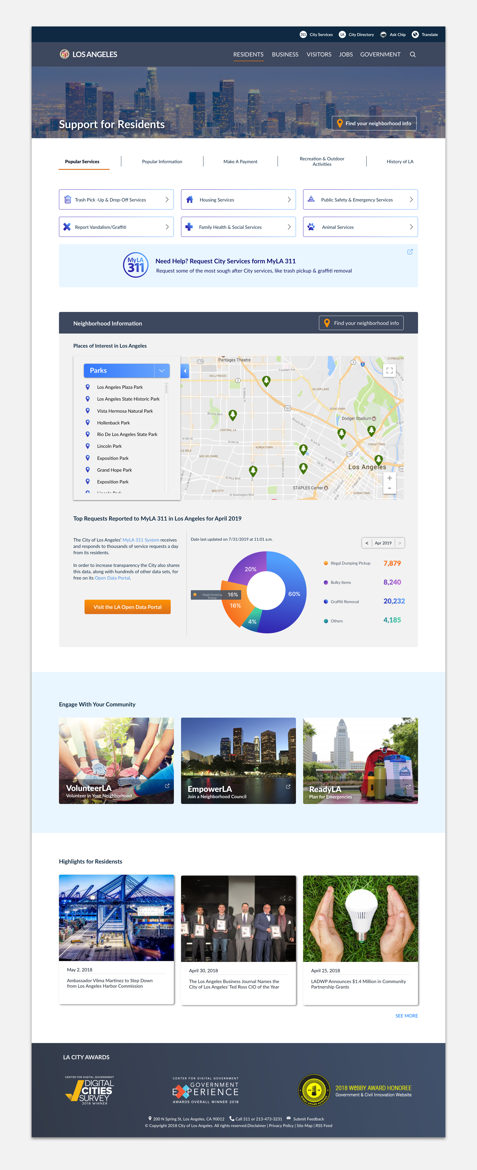
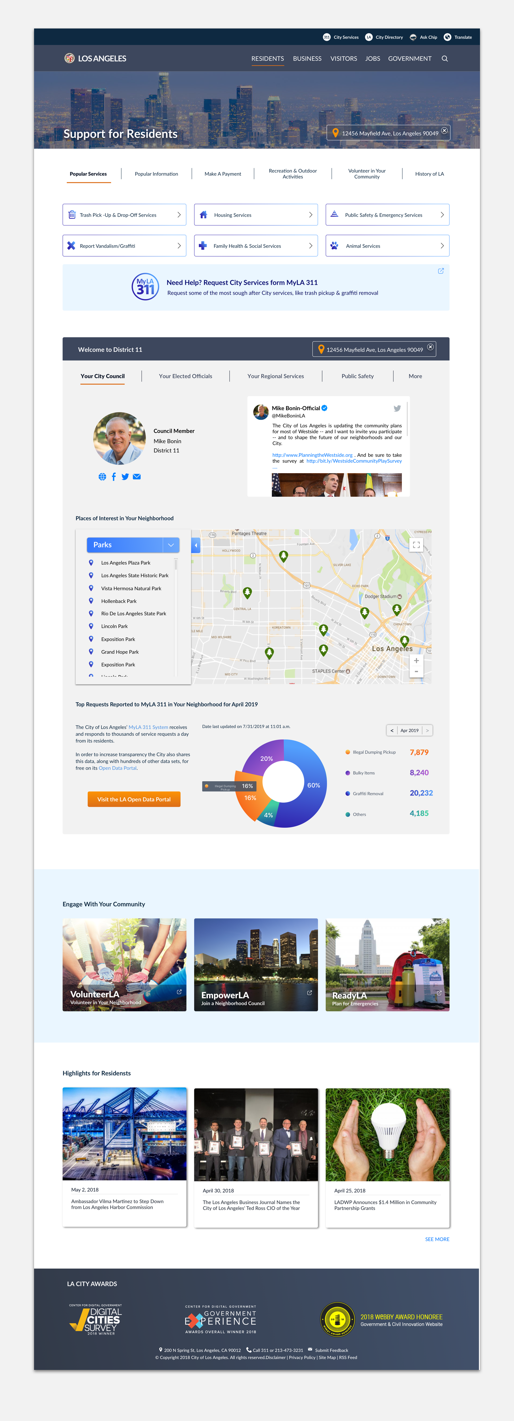
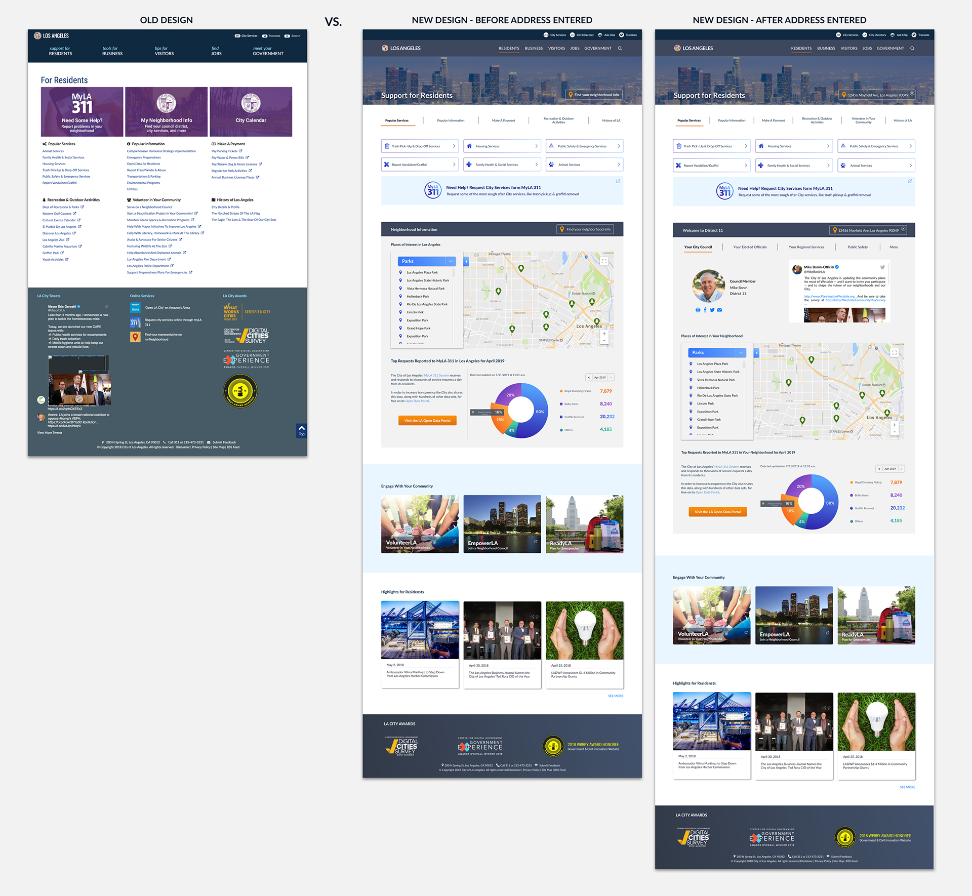
Residents: Re-designing this section was the initial and main motivation of this entire project. The goal was to create an engaging and interactive portal for the Residents of LA where they can customize the page by entering their address and get personalized information about their neighborhood. Therefore, neighborhood info which at a time had its own separate URL needed to be inserted onto the Residents' page. One challenge with this section was to display the inserted data in a clean format without making the page look overwhelming.
Major changes: Visual design and Information Architecture
Residents - After Address Entered
Before address is entered the map and the graph data default to the City of LA but once users enter their address, the map will be zoomed in to their area to show places of interests and the graph will show the data specific to their neighborhood.
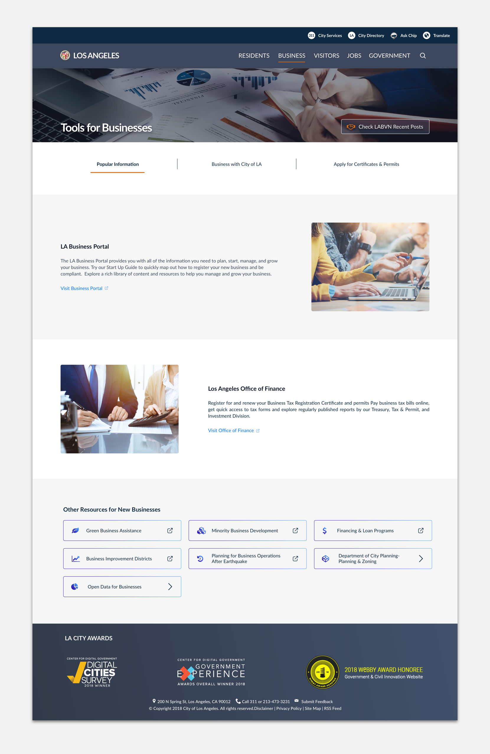
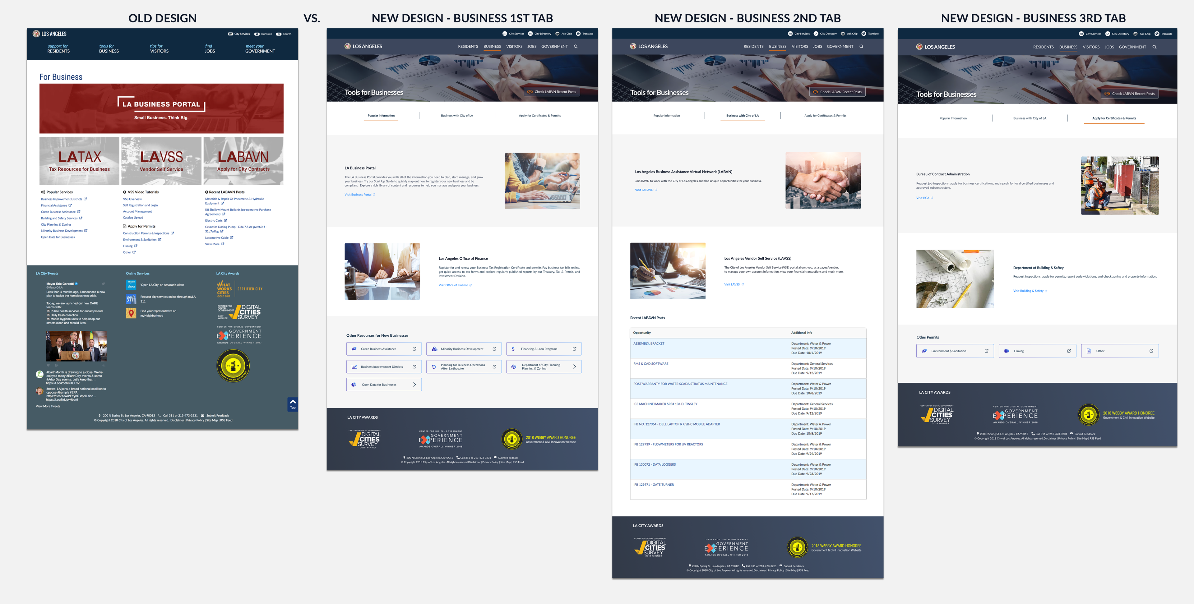
Business: In this section, we needed to focus on three groups: 1. Those who want to start a business in the City of LA 2. Those who want to do business directly with the City 3. Those that already have businesses but are looking into applying for or renewing permits or certificates.
Major changes: Visual design and Information Architecture
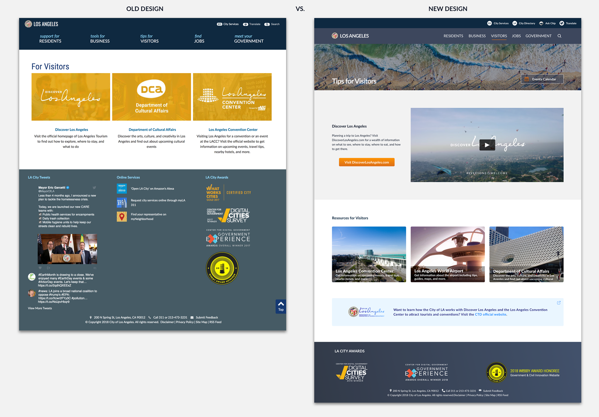
Visitors: This is the only section where we did not need to add content. Just a welcome video was added for the travelers and the major change was applied to the interface only.

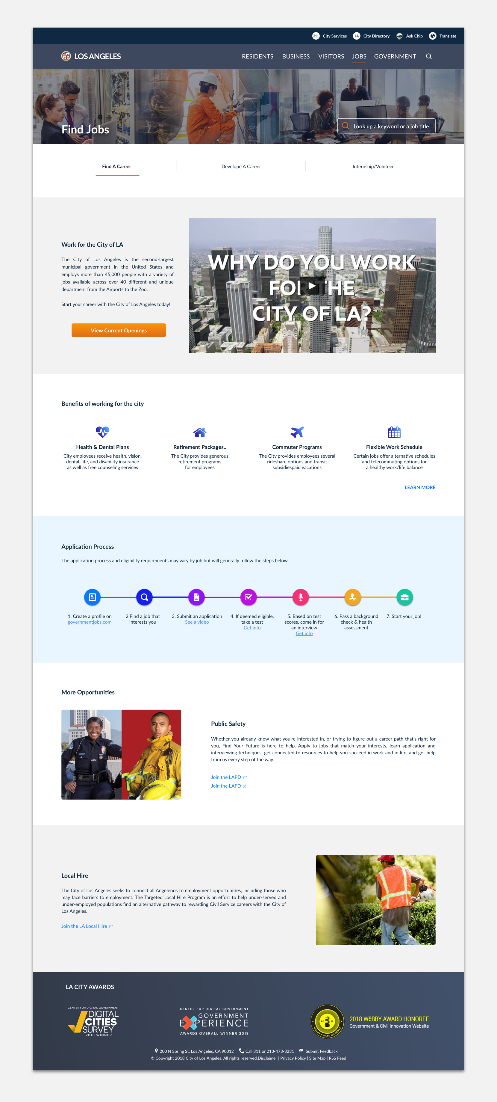
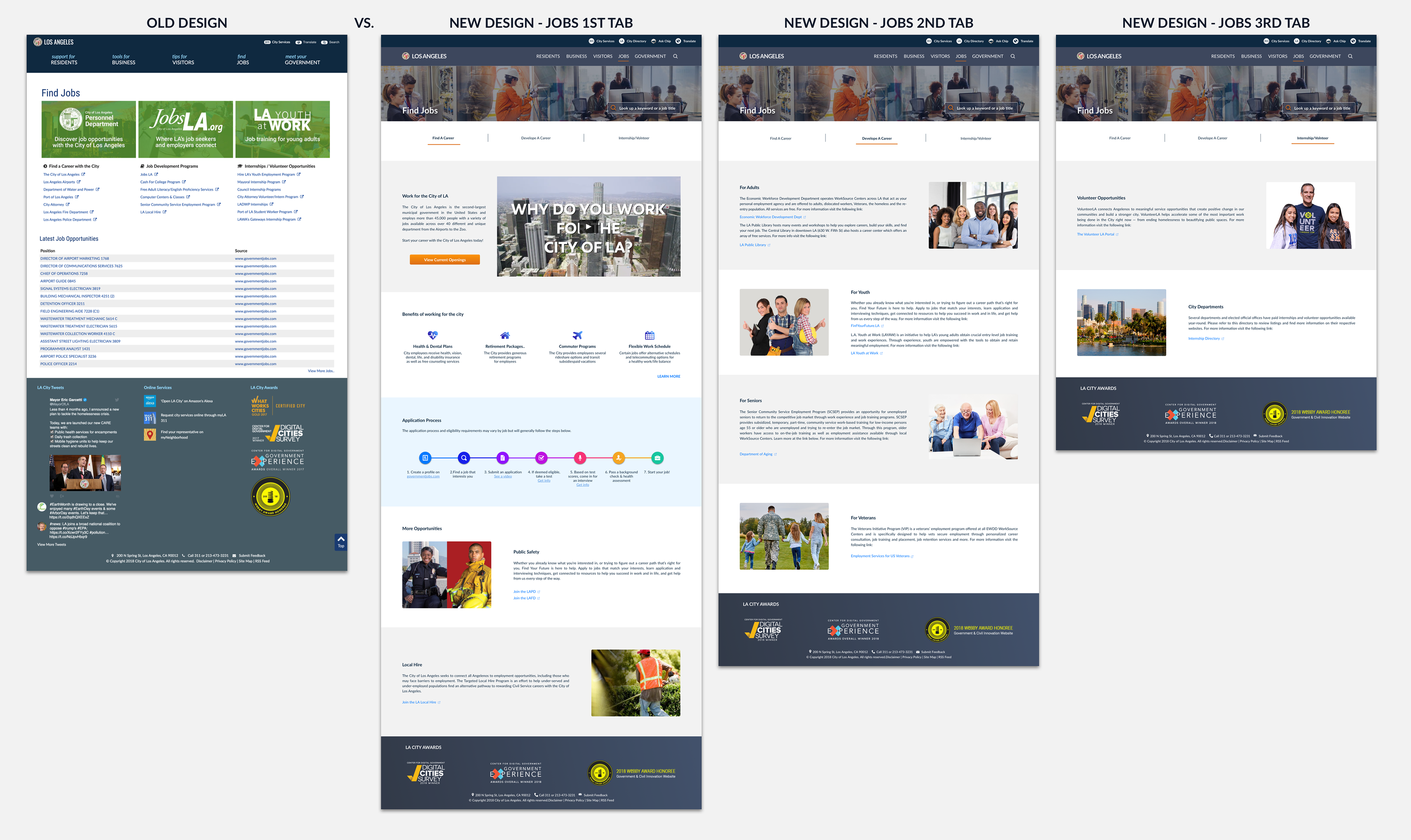
Jobs: Again in this section, we needed to focus on three groups: 1. Those who are looking to find a job in the City 2. Those who want to develop their job skills 3. Those who are looking for internships and volunteer opportunities with the City. For each group, we needed to create content, but the heavy lifting was done for the first group because we wanted to make them excited about working at the City and also provide them with a clear understanding of City job application processes.
Major changes: Visual design, Information Architecture, Added content
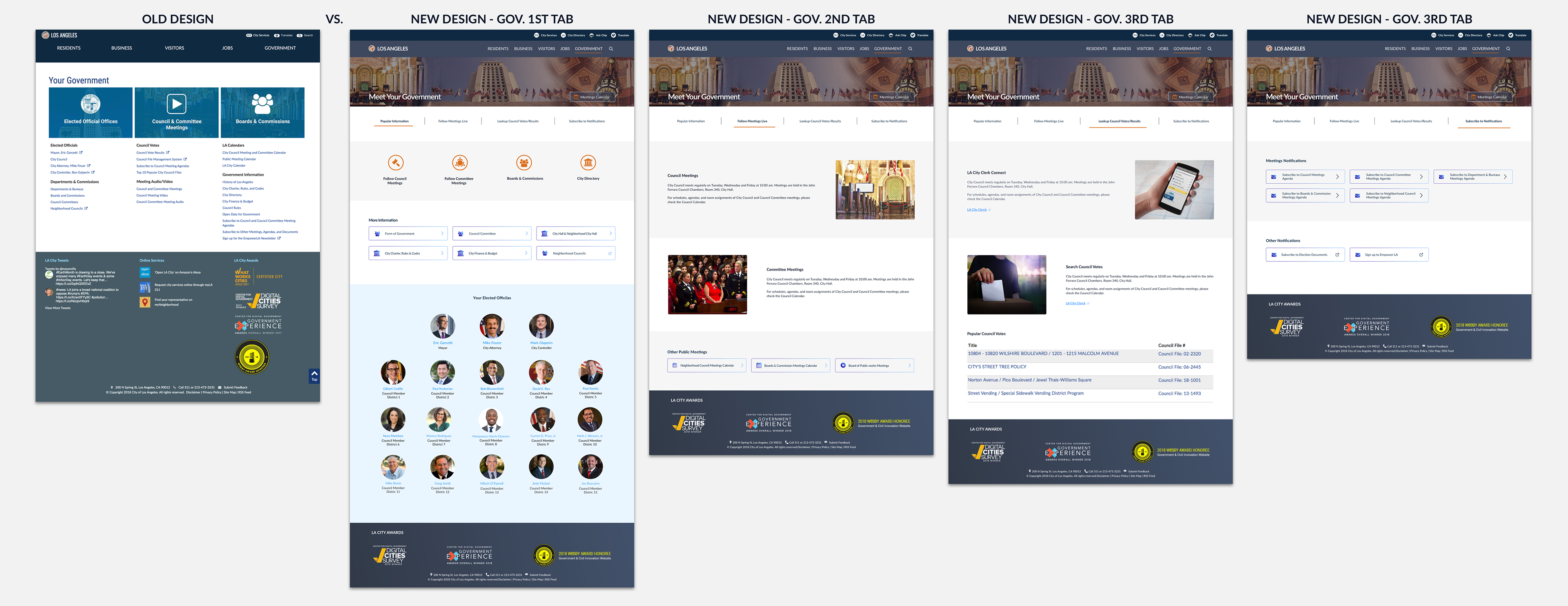
Government: For every section, we had several meetings with the stakeholders to ensure we are meeting the requirements, but for Government, in particular, we needed to be more cautious. Although one very important and most visited section on this page is the meetings, we needed to find a balance on showcasing the City elected officials and other important organizations on the landing page as well.
Major changes: Visual design, Information Architecture, Added content

User Testing (A/B Testing - Residents)
Since the first version of new design was launched (Homepage and Residents only) in Jan of 2019, the team has been monitoring the analytic reports and found some issues. The report showed not so many people are clicking the main CTA on the Resident page which is entering their address. We figured there might be a problem with the design. So we came up with some alternatives by making a few minor changes that we assumed could have a big impact. Later we did an A/B testing (A being the live product and B the new Proposal - in the clickable prototype format) with a diverse group of audiences to validate our assumption. The result was positive and attendees were more responsive to the new proposal. Other issues also came out during these testings which were addressed in the new proposal later, like some font sizes and the map’s unintuitive dropdown menu.
Some Facts
• Tis project started in March of 2018 with focusing on the Residents section and was first launched in January of 2019. Since then it has gone through multiple iterations and the newest version will go live by the end of 2019. Other sections of the website (Business, Visitors, Jobs, and Government) are still under development and will be launched around the same time.
• In each and every phase of this project, I have worked closely with the City's talented dev team to ensure hands-off transparency and execution ease considering the tech team’s limitations and project timeline. • The mockups that I’ve shared here are the latest version of the design which is now under development so they look different from the current live project.
Some Before/After Snapshots
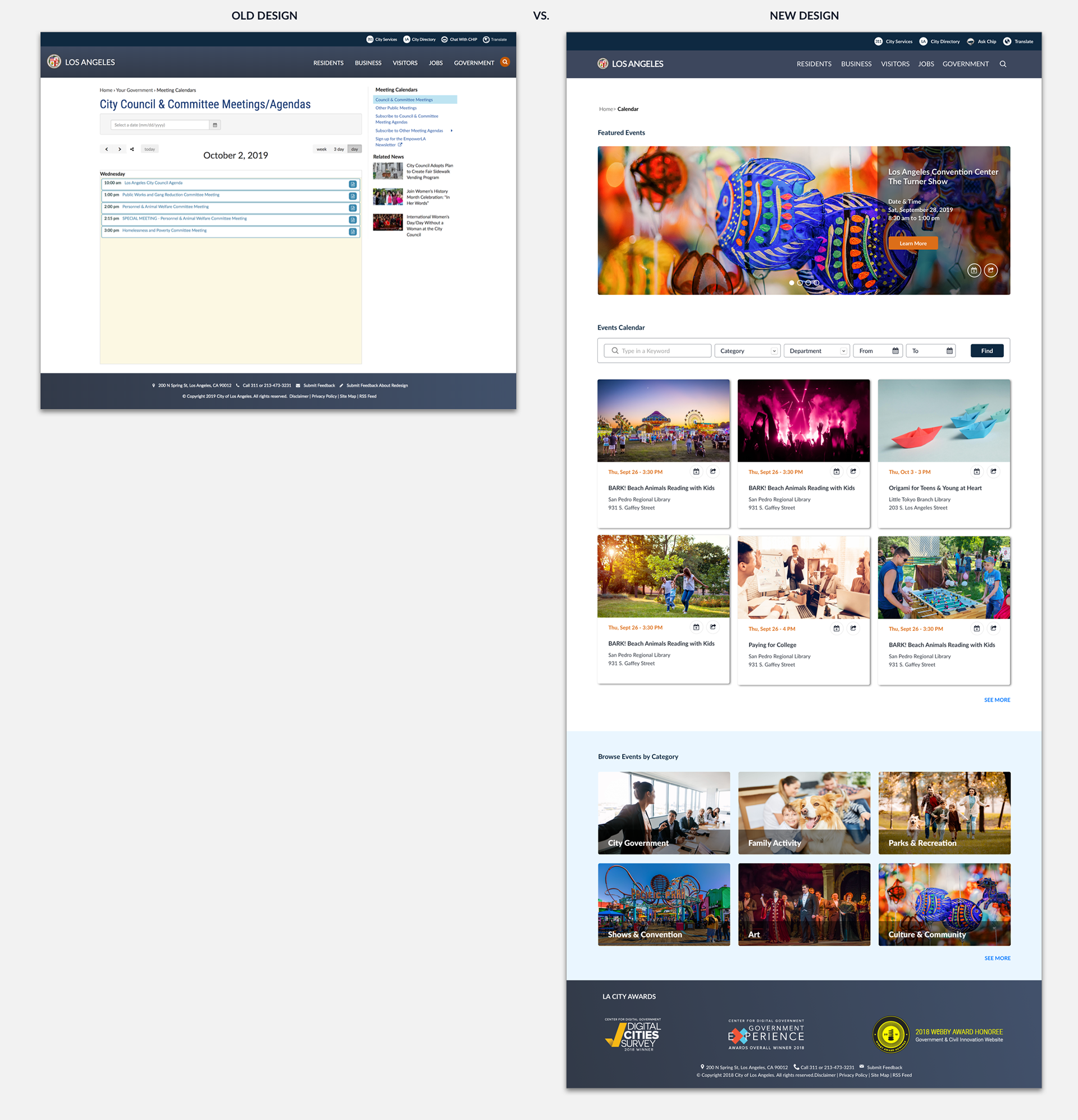
Calendar
Residents
Business
Visitors
Jobs
Government
Thanks for reading all the way through and feel free to shoot me an email if you have any questions. :)