Intro
The Information Technology Agency (ITA) of the city of Los Angeles works to improve the lives of L.A. residents, businesses, and tourists through digital means. Their effort is to keep Los Angeles at the forefront of government accessibility, reliability, and innovation. Since a great majority of City employees are becoming eligible for retirement, ITA wants make sure they put priority on attracting new workers through their website in particular. Our team was tasked to redesign ITA’s current website to better target potential new applicants.

Client: LA City Information Technology Agency (ITA)
Roles: UX/UI Designer, UX Researcher and Project ManagerTools: Sketch App, Lucidchart, Whiteboard, Pen & Paper, Marvel, Xtensio
Platform: Desktop
Team: Mona Kim, Targol Parsa, and Kimia Mostaghimi
Timing: 3 Weeks
Problem
ITA website has trouble engaging users due to lack of proper content and an appealing Interface that would represent a world-class IT department.
Design Goal
We wanted to create an engaging, informative and, intuitive interface for users with the focus on job seekers by highlighting ITA's innovative work, award-winning team, and the benefits of working for the City of Los Angeles
Redesign at a glance
Research
1. Heuristic Evaluation: Knowing that there were some usability problems in the website we started our research with a usability inspection method called Heuristic Evaluation. This enabled us to identify the interface design problems as well as the structural and navigational issues.

2. User Interviews: In order to validate our findings in the first step, we needed to conduct user interviews. Since the priority was with the job seekers we started the interviews with ITA’s new hires to understand their pain points in using the website and specially throughout the hiring process.
3. Stakeholder Interviews: We also conducted interviews with stakeholder to make sure we understand the business goals. Brand prism exercise helped the stakeholders to breakdown the core purpose and values of ITA which in turn gave us a clearer understanding of the project scope. In the meantime we were able to identify other potential visitors of ITA website.
User's pain points
4. Affinity Map :The next step was to Identify the most critical user data from the user interviews to include in our persona and organize our insights by using an Affinity Map. This would also help us create our persona, come up with the value proposition, and prioritize our features.
5. Content Audit: Since ITA is a heavy content website it was important for us to run a content audit to understand what information is available on the website, how it would help the users, and if we needed to rearrange those content to make the navigation easier and more intuitive for the users.
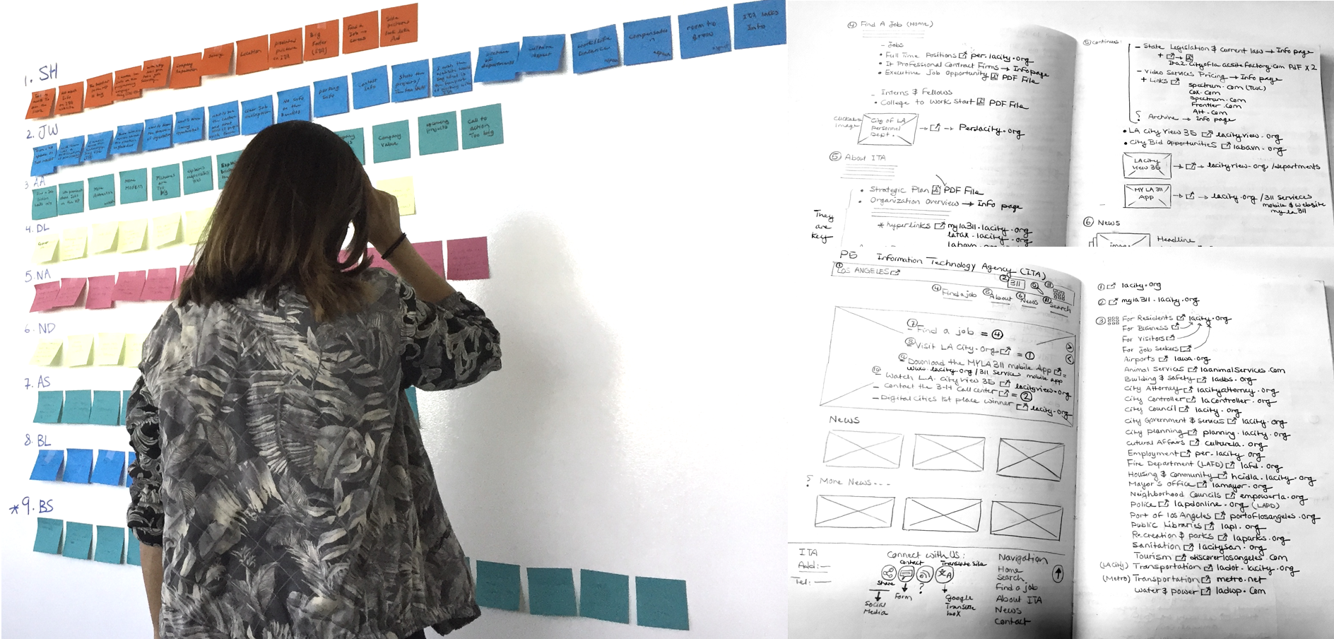
6. User Persona: Now it was time to introduce our persona, Amy. Throughout the whole process, Amy reminded us who the user was, she focused our design efforts on solving her problems, she aligned our team efforts and consolidated our knowledge.

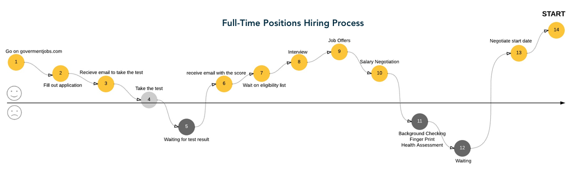
7. User Journey Map: We also draw a journey map for Amy’s job application process to better Identify negative areas in her journey as starting points for designing solutions.
Strategize
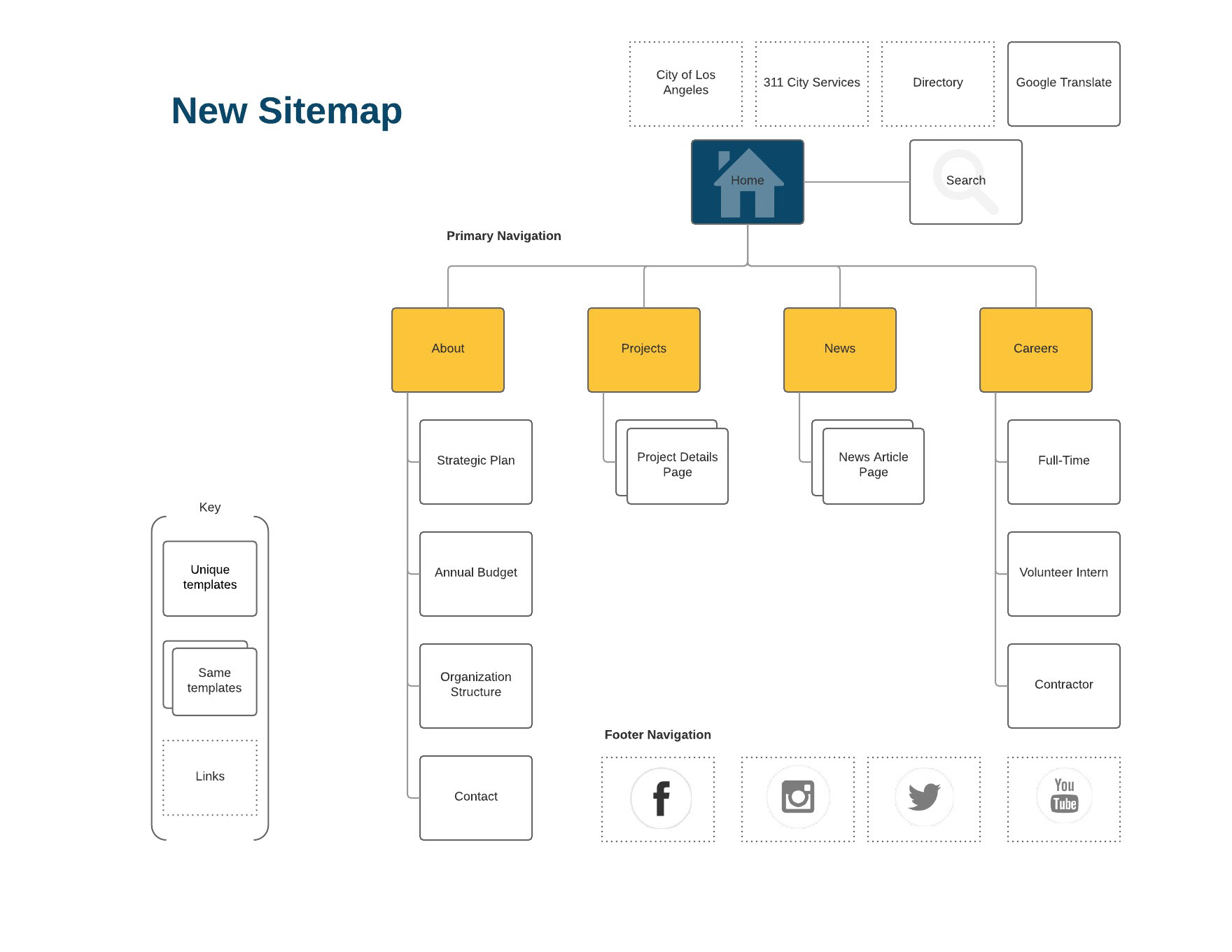
1. Sitemap: Having all that data from our research we were ready to kick off the next phase. Doing the content audit had helped us have a clear idea of the new information architecture based on user's needs. We also needed to create a sitemap to depict the depth of the website and to inform the database and navigation design.
Design
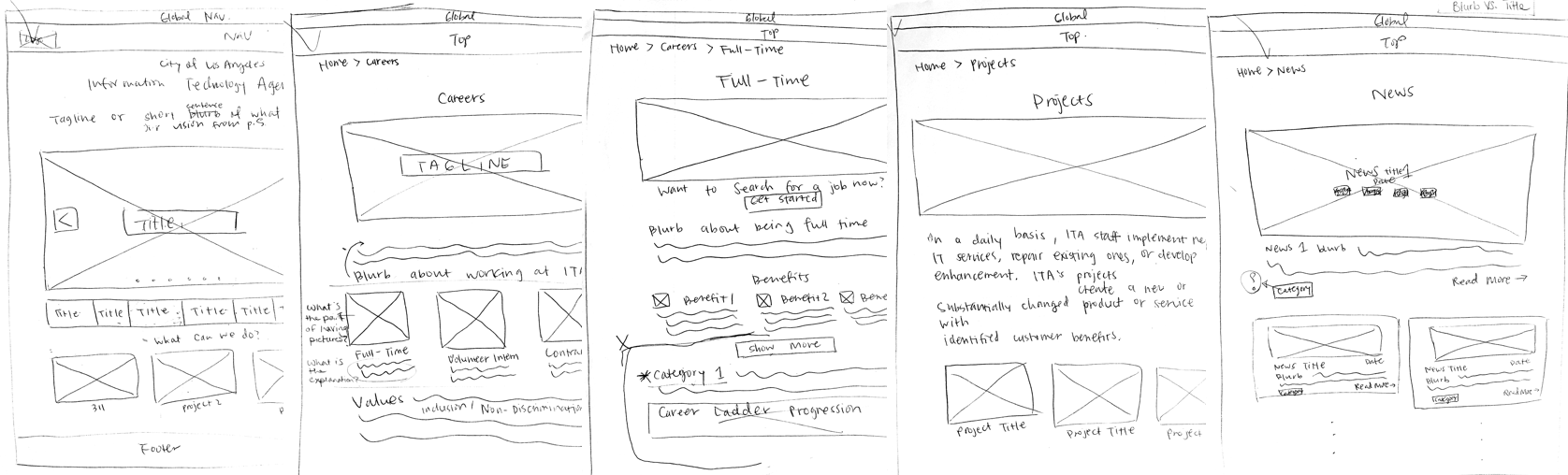
Sketches
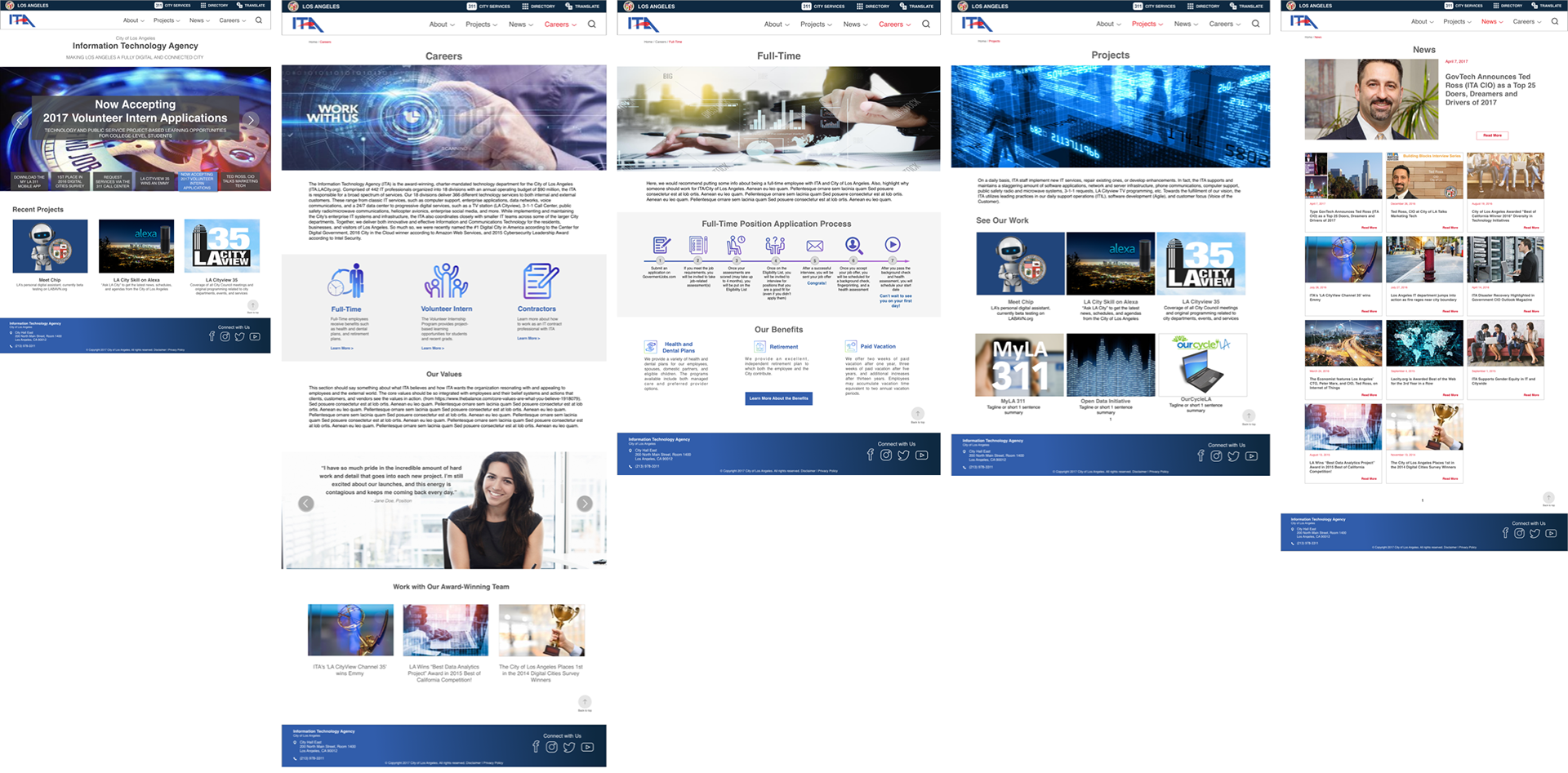
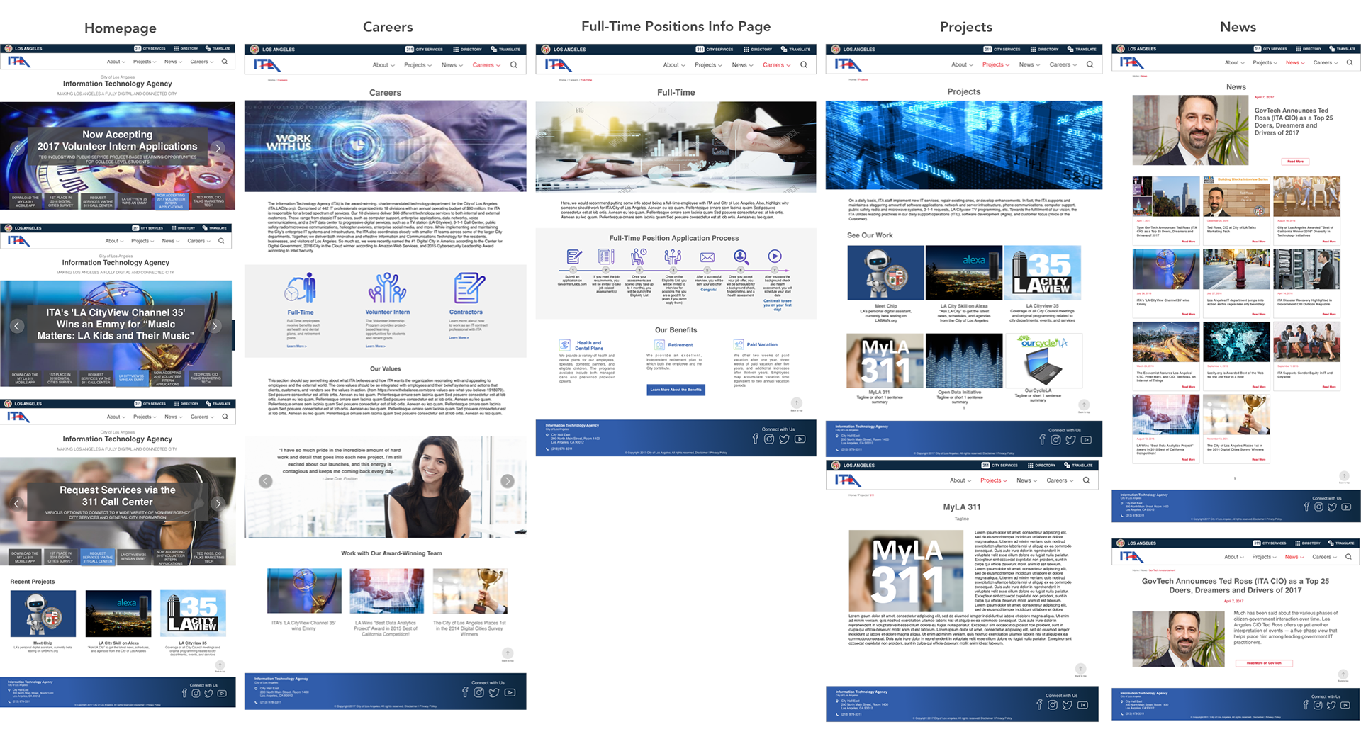
Hi-fidelity Mockups
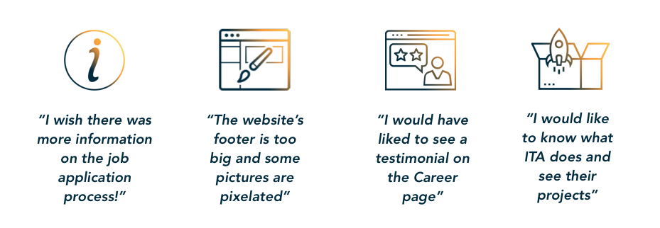
User Testing
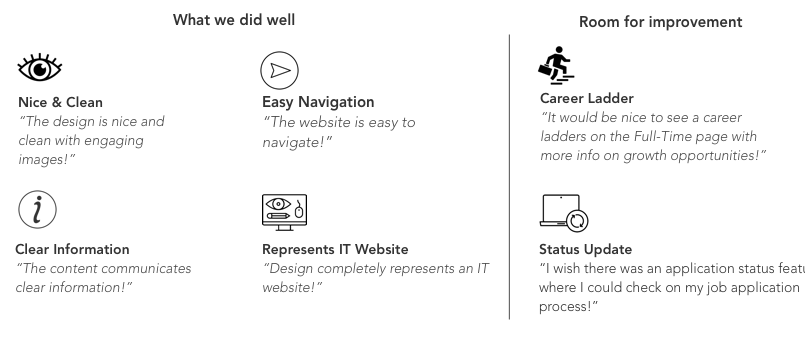
The first round of user testing helped us identify user frustrations to address how to improve the page designs, navigation and flow. We had the opportunity to do our first iteration and here is some of the feedback we received after the second round of user testing with the clickable prototype:
Prototype
A clickable prototype of ITA website redesigns built in Marvel.
Next Steps
• Add a section dedicated to Vendors that explains how they can work with ITA or the City of Los Angeles
• Add a career ladders to the Full-Time page with more info on growth opportunities
• Add an application status page where an applicant can check on their job application status and see what the next steps are
• Expand on the contractor info to make it more interactive
• Expand on the leadership team info to make it more interactive
• More unique content created by ITA with announcements, tips, and other news, and more effective use of social media
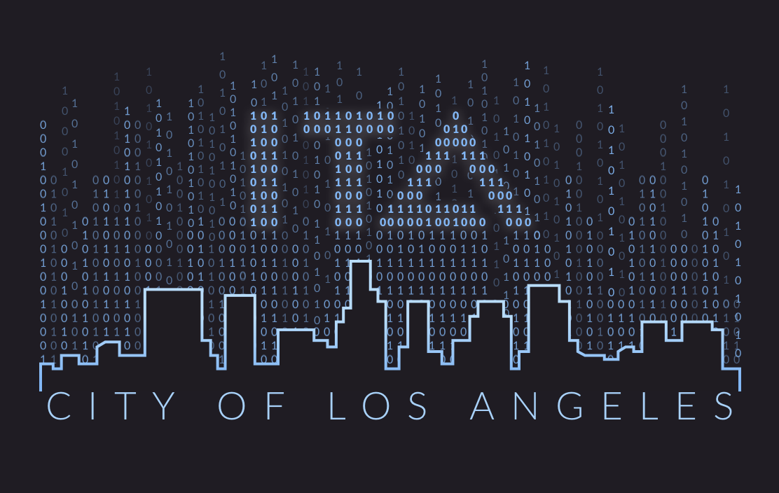
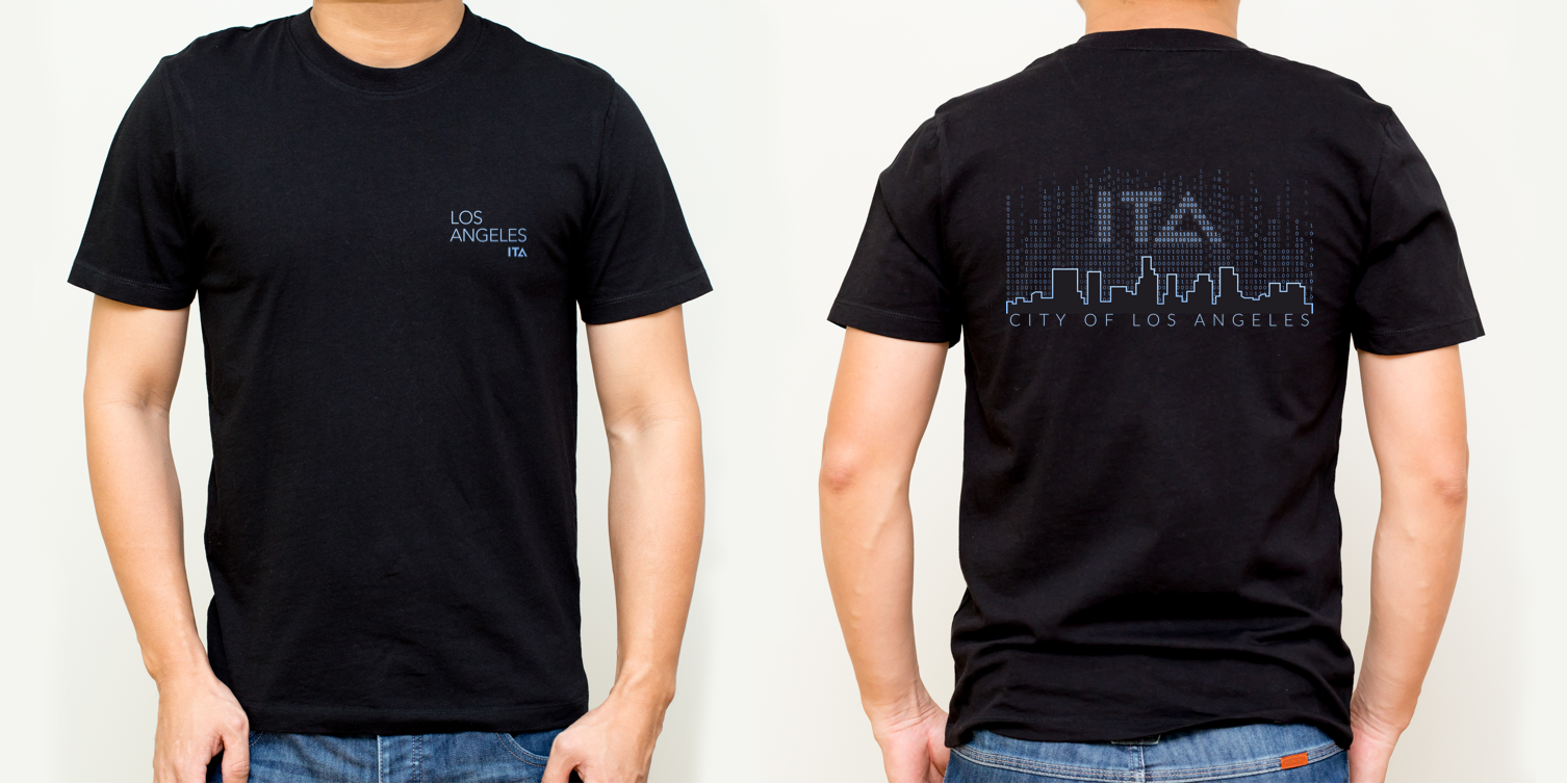
ITA T-shirt Graphic Design
I designed the T-shirt's graphic for ITA's holiday party fundraiser in 2019 - Design tool: Sketch