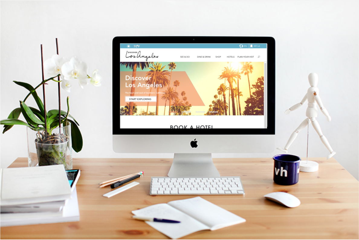
Intro
Discover Los Angeles is an online platform for Los Angeles Tourism & Convention Board. LATCB is responsible for sales and marketing efforts focused on the meetings & convention industry, domestic and international leisure travelers, worldwide travel trade and consumer media.
In this project, hotels and shopping centers concierges were the target audience and improving the website usability in finding the destinations (Museums & Galleries) was the main objective of the project.
Role: Lead UX Designer
Tools: Pen & Paper, Sketch App, InVision, Photoshop, Balsamiq
Deliverables: User Persona, Journey map, Sitemap, User-flow, Sketches, Wireframe, Hifi Mock up, Prototype.
Timing: 2 weeks
Problem
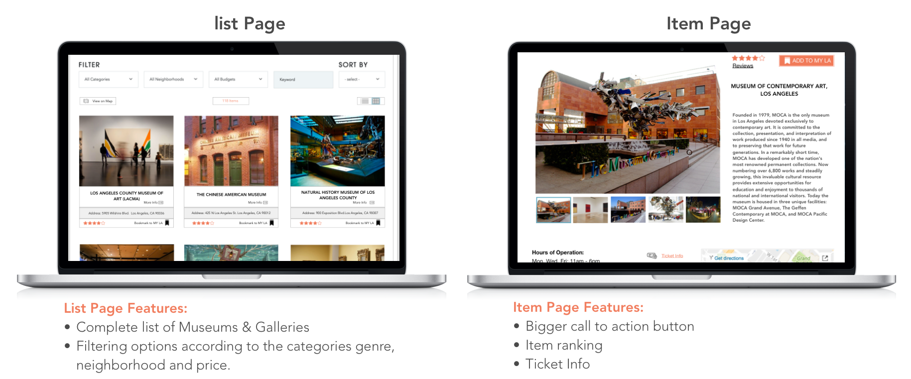
• Confusing navigation and too many clicks to get the museum’s list
• Poor filtering
• No ticket and rating info for each museum
Design Goal
• Streamline the information architecture in order to help hospitality professionals find destinations listing faster and easier.
• Redesign the search filtering features to have a more accurate search result.
• Categorize the destinations added to the user’s profile by their genre.
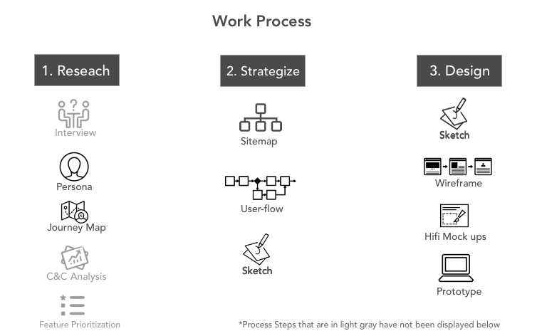
1. Research
User interviews showed hospitality professionals struggled to find the list of the museums in Los Angeles for their guests through the normal flow of the website. And if they wanted to use the search engine the result would not be accurate.
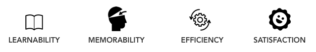
First I needed to identify the problems. Heuristic Evaluation helped me understand what qualities of a user-friendly website were being violated; Learnability, Efficiency, Memorability and Satisfaction.
Heuristic's Violated
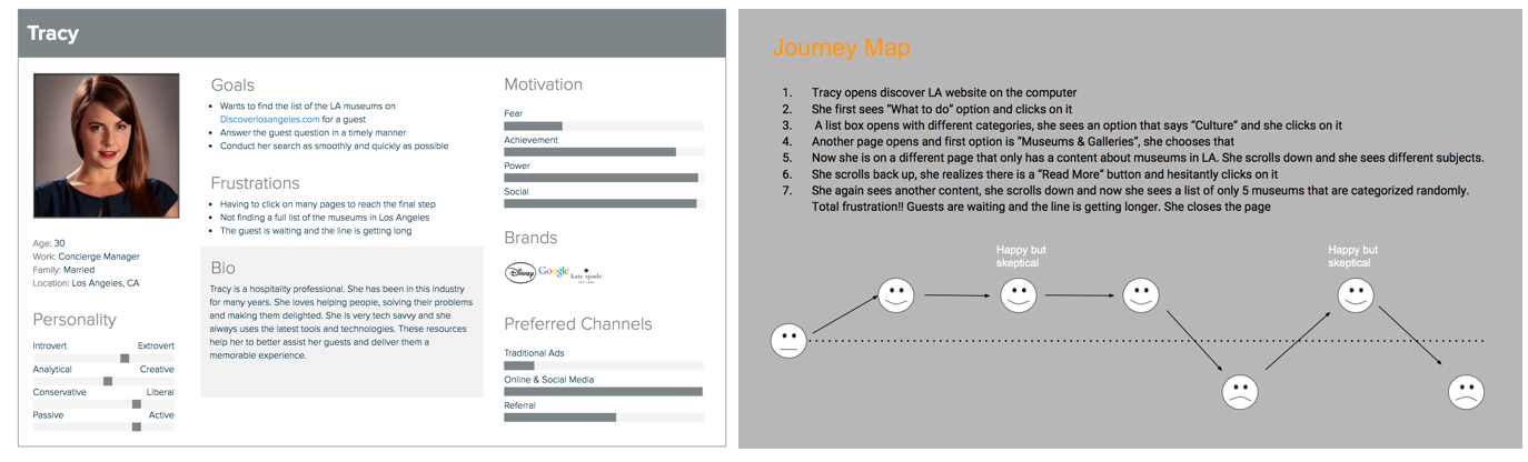
I found my persona from the interviewees. Tracy helped me stay focused on her needs and goals. By knowing her I was also able to better relate with her world and come up with solutions easier.
User Persona/User Journey Map
I also needed to look at other travel websites in the market. Some of the websites I used were Santamonica.com and TripAdvisor. This analysis method helped me come up with the important features to add or change in the current website.
C&C Analysis

2. Strategize
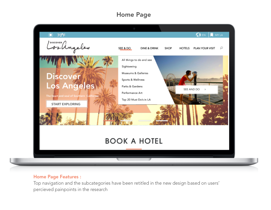
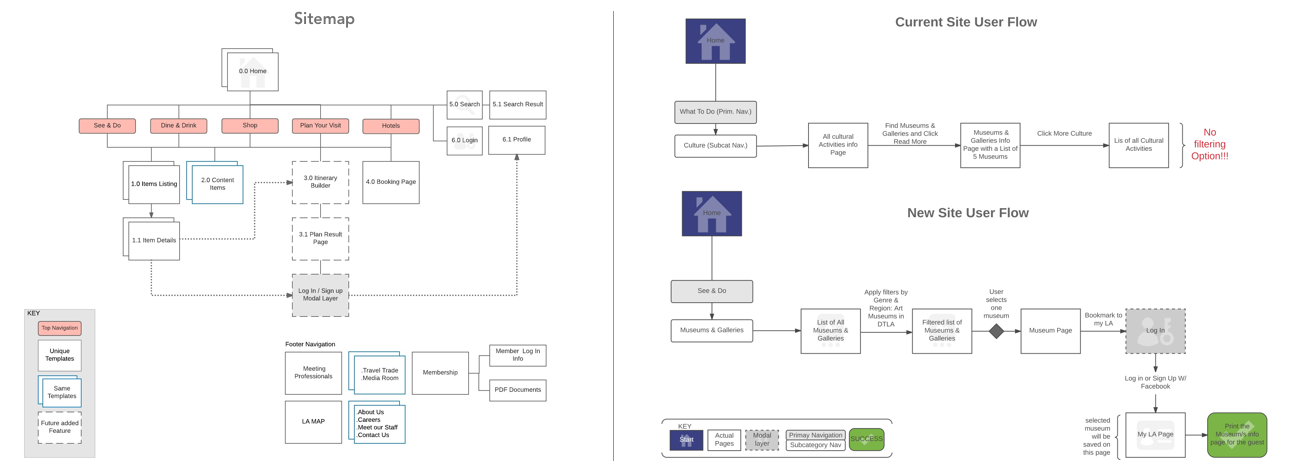
Based on user research I knew that the current categorization and navigation titles on the website were slightly confusing. Looking at other websites also helped me have a better idea of how to rearrange the taxonomy and streamline the information architecture.
In order to streamline the IA, I needed to draw a new sitemap and user-flow to illustrate the depth of the website and inform the navigation design.
Sitemap/User flow
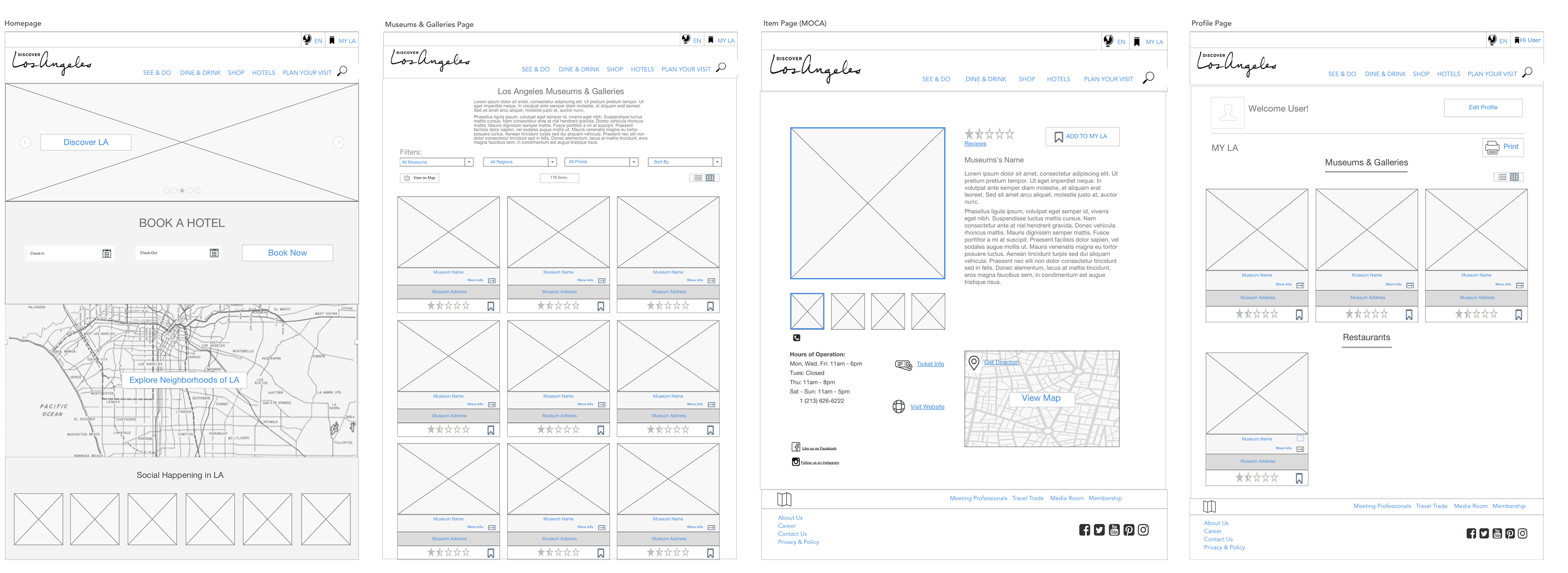
3. Design
Wireframe V1
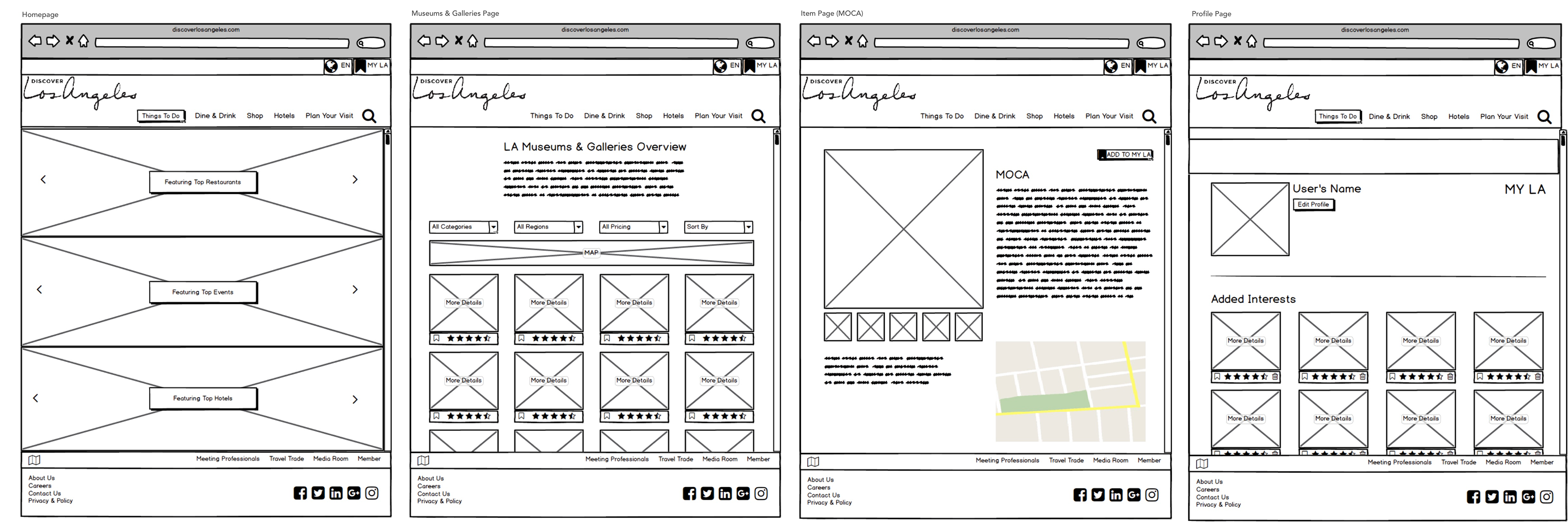
Wireframe V2 (Iteration)
Prototype Video
After several rounds of iteration and user testing on the lo-fi wireframes I created the final visual design of the website. Please click play to watch the prototype video of my redesign.
What Next
Create an Itinerary builder where the users can bookmark their interests and have a journey plan created for them based on their needs and desires.